To ensure gift delivery by 12/25, please place orders via UPS shipping no later than 12/17.
CloseWeb Accessibility is Beautiful and Delicious

Happy Global Accessibility Awareness Day (GAAD)! A primary focus of GAAD is ensuring that web content is accessible. It is not enough to merely focus on Web Content Accessibility Guidelines (WCAG). As Jenny Lay-Flurrie, Chief Accessibility Officer at Microsoft explains, web content accessibility guidelines are the floor, the bare minimum web developers must do. What is important is that web developers make beautiful, intuitive, easy to use websites. WCAG standards are important for accessible web design, but they do not ensure wonderful user experiences. This is why Lay-Flurrie, the American Printing House for the Blind, and other accessibility advocates emphasize the need for user testing by people with disabilities. Usability and functionality are essential. Automated tools are inadequate and often remedy few accessibility issues.
Lainey Feingold is a web accessibility advocate who works to ensure that websites are accessible. She often speaks of how you cannot think about inclusive design and accessibility at the end of product development or content writing. Inclusion must be baked in at the start. organizations need to “bake” accessibility into their culture and DNA. This is something we are working on here at APH. Many other web accessibility advocates have created their own delicious food analogies to illustrate this concept. Cordelia McGee-Tubb, web accessibility engineer at Salesforce and co-host of the 13 Letters Podcast stated: “You can’t put the blueberries in the muffin after the muffin is baked.” Nandita Gupta, a graduate student at Georgia Tech, whose master’s project delved into what makes teams practice inclusive design, stated “You can’t sprinkle garam masala on top in the curry… it has to be cooked in to truly give that amazing flavor so just like accessibility cannot be sprinkled on top, garam masala needs to be cooked into the curry.” You can read more of Lainey Feingold’s list of accessibility food analogies in her blog post. Have delicious accessibility analogies of your own? Share them with Lainey for future updates to the list.
Well-designed websites developed by people who keep all users in mind are beautiful and delicious. While our work advocating for accessibility is never done, take some time today to think about recent wonderful experiences you have had browsing the web. Feel gratitude for the accessibility-minded web developers who create beautiful, functional, and accessible websites. Consider thanking them for baking in those indispensable accessibility blueberries!
Share this article.
Related articles

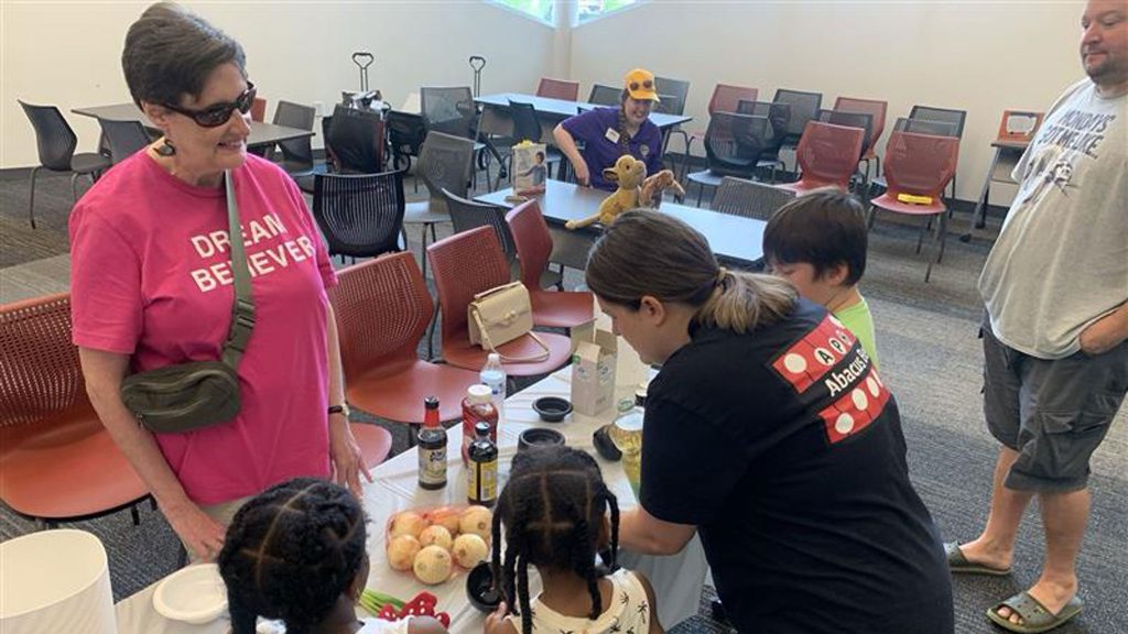
Connect the Dots and Dot Experience Cast Provide Perspective on Access and Inclusion
Access and inclusion are core values at the heart of The Dot Experience and our education series, Connect the Dots,...

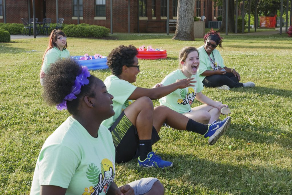
Adapted Physical Education: Enhancing Inclusivity for Blind and Visually Impaired Students: The Future of Inclusive P.E.
No child should be left out of an activity due to being blind or having low vision. Unfortunately, this happens...

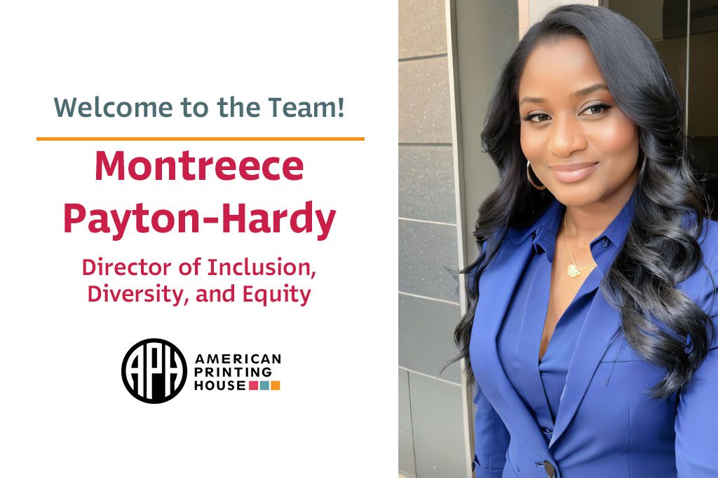
APH Welcomes Montreece Payton-Hardy as Director of Inclusion, Diversity, and Equity
The American Printing House for the Blind (APH) is pleased to welcome Montreece Payton-Hardy as the new Director of Inclusion,...
